A Visual Playground of Type
by Jen White
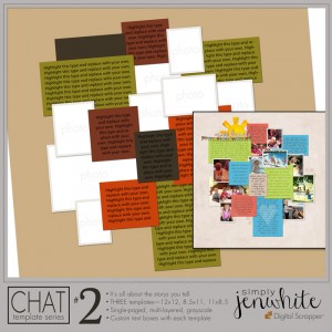 The newest template in my CHAT Template Series opens up a lot of possibilities for playing with the Type tool. Because of all the journaling spots in this template, this is great opportunity to create a visual playground of type.
For my sample page I used all handwriting fonts. In fact, I generally use at least one handwriting font on every scrapbook page I create. My favorite place to get personalized fonts like these is from Darcy Baldwin, of course.
Credits: Papers & Elements from Weekend at Home by Kate Hadfield, Fonts from Darcy Baldwin
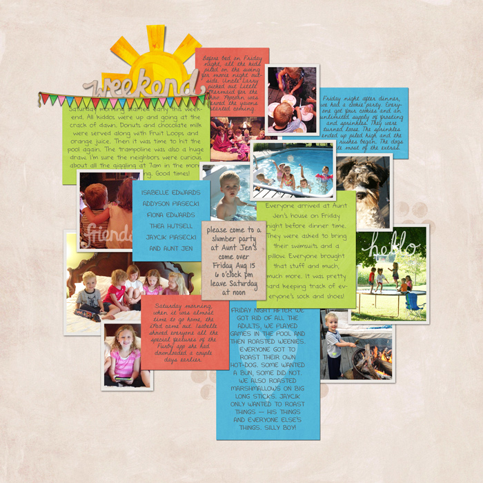
On the scrapbook page above, I had a big story to tell. Reading all that journaling can get tiresome. To keep my viewers eye interested in what I had to say, I used three basic techniques within the Type tool.
Vary the Font
For my page I chose four of my favorite Darcy Baldwin fonts and mixed them up on the page. One was a script font and the other three were print. I used: DJB Almost Perfect, DJB Leoni Regular, DJB ANNALISE 2011, and DJB Donnascript. Darcy has lots of fonts to choose from that would work GREAT for this technique. Check out her selection of fonts in our shop.
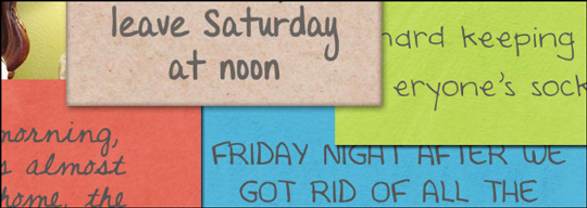
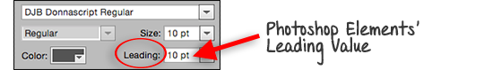
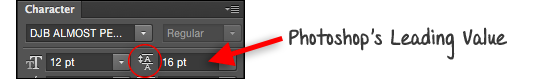
Vary the Leading
It doesn’t seem like much, but leading can make a huge difference towards making a scrapbook page look complete. Leading refers to the space between the lines of journaling. For example, if you want to fill up a journaling card, but you do not have enough type to make it look “full,” simply increase the Leading. Or in contrast, if you have a little too much type, decrease the Leading a tad to make it all fit. To do that:
In Photoshop Elements:
• In the Tool Options of the Type tool, click on the
In Adobe Photoshop:
• In the Character panel, hover your cursor over the Leading icon, then click and drag to the right/left to “scrub” the value higher or lower.
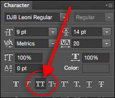
Vary the Caps
That’s not really a technical term. It’s just my way of saying—make some of your journaling cards in upper and lowercase as you would in normal writing. But then to mix things up, throw in a couple cards where all the journaling is in capital letters.
In Photoshop Elements:
• Turn on the CAPS Lock key while typing your journaling.
In Adobe Photoshop:
• In the Character panel, click on the All Caps icon to activate it. Pst… don’t forget to turn it back off when you are done! It’s sticky!
_____________________________________________
 Author: Jen White | jen@digitalscrapper.com
All comments are moderated.
Please allow time for your comment to appear.
Leave a Reply